
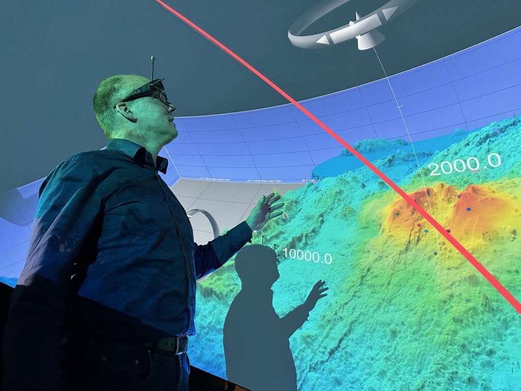
Have you ever presented a complex dataset, only to realise midway through your presentation that your audience is struggling to follow your results and conclusions?
According to Hans-Jörg Schulz, Associate Professor of Data Visualisation and Visual Analytics at Aarhus University, there is an effective way to make research findings more accessible and easier to understand: data visualisation.
“Even if these days AI is helping enormously with analysing large datasets, you will always need to plausibility check and contextualise its outputs. For that, students and researchers around the world can benefit very much from data visualisation,” he says.
Data visualisation is the graphical representation of information and data through visual elements such as charts, graphs and maps. Because the human brain processes visual information far more quickly than raw text or numbers, visualisation can reveal hidden patterns, trends and outliers within complex datasets.
Researchers interested in developing these skills can take part in the upcoming two-day Data Visualisation Workshop: “From Theoretical Foundations to Implementation and Communication”, which will be held in Aarhus on 5-6 November.
Can help identify critical issues within a dataset
“Too few people are aware of the advantages that data visualisation can offer, for example in improving how research findings are communicated,” says Hans-Jörg Schulz.
He continues:
“Equally important, data visualisation can help identify issues within a dataset. It can reveal inconsistencies, errors or anomalies in the data and therefore acts as a valuable sanity check. In that sense, it is not only a communication tool, but also an analytical one.”
Hans-Jörg Schulz is one of the workshop organisers and will also run the interactive lectures, exercises and discussions of the main workshop programme.
The workshop is free of charge and aimed at early-career researchers, including data scientists, basic and translational researchers, clinical researchers and clinicians working within the scope of the organising academies: Danish Data Science Academy, Danish Cardiovascular Academy, Danish Advanced Research Academy, and Danish Diabetes and Endocrine Academy.
Data visualisation as a part of university studies
Schulz believes there is a strong need for more training opportunities of this kind, as well as greater integration of data visualisation into university studies.
“In Germany, where I come from, data visualisation is often included in the regular Computer Science study programmes. The reality is that these skills are needed. Unfortunately, there is a great deal of poor visualisation out there,” he says.
“When used properly, data visualisation not only helps others understand your data and your research, but also enables you to examine your own data more critically. Every good scientist needs that capability,” Hans-Jörg Schulz adds.
Lacking the needed deep contextual knowledge, artificial intelligence is not equipped to perform this critical evaluation reliably on its own. Researchers therefore need a solid foundation in basic data visualisation skills.
Sign Up for the event here.